UX Design: Inspection App Improvements
Project Background
HappyCo, a real estate Software-as-a-Service startup, had recently released a new version of its popular Due Diligence application (DD app). The DD app streamlines the workflow of inspecting units and common areas of an apartment complex prior to acquisition. Because the original DD app was a leading tool in the market, it was critical that the new app met expectations - and ideally exceeded them.
Due Diligence Process
Prior to acquisition of a property, a team of on-the-ground inspectors are employed by the investor to complete unit inspections on the entire property. This process is carried out over 1-3 days, often with unit counts in the hundreds, and allows the buyer to get a detailed picture of the condition of units before a takeover. Speed and efficiency are key to this process, and small changes can make a big difference.
Inspectors typically have targets set by their manager (for example, 90% of units inspected). If a unit is inaccessible, the inspector will mark 'No Entry' via the app and leave a note for other team members as necessary. Importantly, the inspector may attempt to revisit these units if inspection targets are not yet hit.
My Role
After receiving the brief, I was responsible for taking the project from ideation through to delivery. This included:
• Reviewing customer feedback describing the problem
• Sketching the current workflow and getting familiar with key screens in the app
• Exploring new workflows through user journey maps
• Getting several rounds of feedback from the team
• Finding a solution and refining it with hifi designs and prototyping
• Preparing final designs for delivery, including aligning design system components
• Collaborating with the developer to ensure designs were implemented to a high standard
Process
Empathy Stage
Upon release of the new app, the product team was in touch with customers directly for their feedback, listened to recorded calls, and conducted tracking on GainSight for usability issues.
Define Stage
One usability issue arose related to inaccessible units. If a unit was revisited after being previously marked as 'No Entry', there were some scenarios that had not been fully considered:
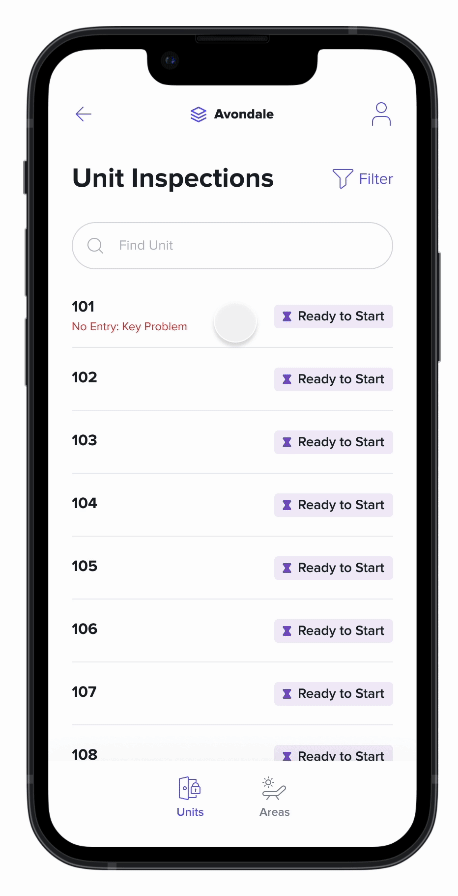
1) There was no way of reviewing a 'No Entry' note. Inspectors could only see the category on the main unit list, which didn't provide the full context.
2) The user experience for a unit with a 'No Entry' label was no different than the experience for a unit that was accessible. Therefore, it was not serving to validate the actions the user was making.
The team was intent on removing unwanted pitfalls such as these that could degrade the reputation of the app and the brand. Resolving these issues would also convey that the company was listening and making customers' lives better in the near term.
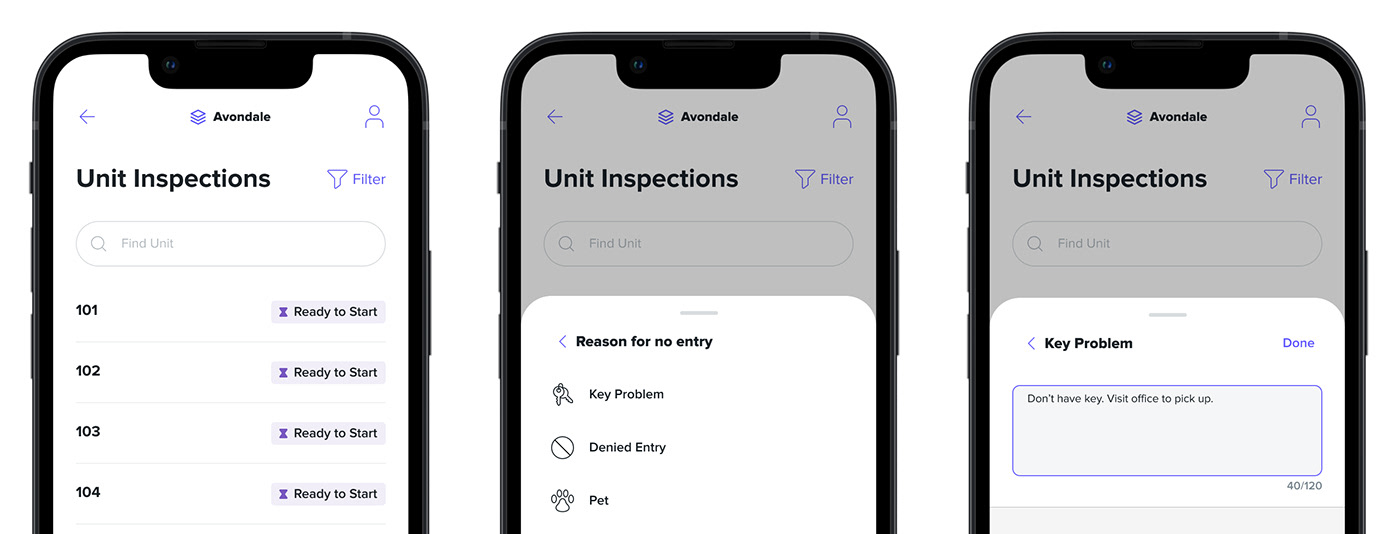
Prototype of the original user path to add a 'No Entry' label
Ideation Stage
Ideation involved workshopping new user journeys alongside the current ones and gathering feedback quickly on these ideas.

Snippets of Feedback from Team Members:
Engineer 1: If returning to the list, it might be worth an animation or indicator on the item that has just been updated to help draw the user's eye back to the unit? Alternatively could we pop up another bottom sheet immediately after clearing the 'No Entry' reason to ask if the user would like to continue with the inspection or return to the list?
Engineer 2: From what I understand, the user would want to remove the label when they are attempting to walk a unit again. i.e right before they are about to go in.
Product Manager: I think keeping it as close to the original flow as possible is ideal to not introduce a new decision. I don't think its very common to remove a 'No Entry' status and not begin the inspection immediately, so the existing flow may suit.
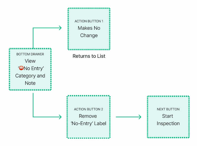
Based on the feedback for the team, we realised the user did not need an action to remove the 'No Entry' label. 'Start Inspection' would essentially imply that the unit was accessible. This 'remove' step was removed from the new flow.
Prototype Stage
Once ideas were explored and constraints better understood, a series of prototypes were developed to validate and refine the ideas. Designs were aligned with the design system and brand, and language was simplified.
New bottom sheet displaying label and note
New flow complete a unit inspection that was originally marked 'No Entry'
